So much information. But what does it mean for me?
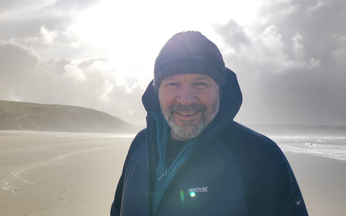
I'm Ian. That was the question I couldn't get answered when I started learning astrology, so I built a way to answer it: look at what is actually there in a chart, before deciding what it means.
This is where Precision Astrology comes from, how it works, and what it can and can't tell you.
I have always been drawn to maps.
As a teenager I wanted to be a cartographer. I served in the Royal Marines from 1989 to 1998, and qualified as a sniper in 1991.
Much of sniper training is observation: reading ground systematically, and recording what's there before deciding what it means. It follows a set sequence, with the naked eye for the whole picture, binoculars to investigate and the telescope for detail.
Later, as a nutritional therapist, I did the same thing with people, mapping someone's case history, the naturopathic way, back to its root cause. I've used that way of looking in business and in the software I build, too.
When I started learning astrology in 2020, I turned it on my own chart. I didn't lack information. Every placement had its paragraph and every aspect its meaning, but nothing told me which of them mattered most.
Observation training has an answer for that: establish what's normally there first, so that what doesn't fit stands out. Without a baseline, everything looks equally important.
"The baseline is what makes deviation visible."
My own chart was the first test.
Once my chart was measured against that baseline, a few connections stood out from all the rest, and for the first time I knew where to look.
What stood out in mine
The numbers aren't the reading itself. What they do is tell me which parts of the chart to read first.
*The chain, measured against a million random charts: about one chart in 500 has a chain this strong. Every point in it moves slowly, so it holds for about five and a half days and everyone born that week shares it. Jupiter–Saturn holds for longer still.
How your chart is read.
The same care runs through everything here, from the free chart to a reading.
- 1 First, your chart is measured Your chart is calculated with the Swiss Ephemeris, a standard astronomical library, to a fraction of an arcminute. Nothing is rounded until it's shown to you. A contact 0.156° from exact is not called exact just because it shows as 0°09' on the page.
- 2 Then it is compared with what is usual Before anything in your chart is called unusual, it's compared with random charts computed the same way: 100,000 of them for single contacts, a million for the larger shapes. That's how the site can say that about 41 in 100 charts have a yod, and 86 in 100 a T-square, instead of calling them rare.
- 3 Then I look for what stands out What's worth your attention is what stands out against that baseline, such as the contacts that are exact and the shapes that are unusually tight. Anything you share with everyone born around the same time is labelled as your generation's, rather than presented as yours alone.
The geometry is measured and written down before it is read for meaning, so that a chart isn't read to fit a picture already formed. Every figure on the site comes from measurement, and when the measurements change, the figures change with them.
Measurement comes first, and meaning after.
The free chart is put together from short pieces, each written once and chosen by your chart's geometry. Two people with the Moon in the same sign read the same Moon piece. What's yours is the selection, the drawing and the measured figures.
A reading is made differently. Your chart is calculated to the arcminute and measured before anything is written. The reading is then drafted for your chart alone, using AI as a drafting tool under a method I built and a library I put together. Each reading is made under my direction, and I am answerable for what it says. Nothing in it is a stock paragraph.
Measurement can tell you what's in your chart and how common it is. It can't prove what your chart means. That part is interpretation, and I'd rather you tested it against your own life than took it on trust.
First, see what is actually there.